

Coca-Cola’s promotional apparel strategy is one of the most interesting examples that every brand marketing manager should analyze. This brand places their logo across a wide spectrum of promotional apparel, creating continuous opportunities to be noticed by people of all ages and genders.
Coca-Cola was the first brand that seriously attracted my attention to promotional merchandise back in 2014. I was given two Coca-Cola sweatshirts that were retail quality and branded to perfection with high-quality prints and beautiful Coca-Cola branded tags. I still have both of them. I think it’s only appropriate for my first review of promo product strategies to be about this brand.
The history of early promotional products
The history of Coca-Cola goes all the way back to the 8th of May 1886 when Dr. John Stith Pemberton, who was a local pharmacist, produced syrup for Coca-Cola.
Dr John’s syrup was then served at Jacobs’ Pharmacy, and mixed with carbonated water. This was a humble start of one, if not the most, iconic brands in the world.
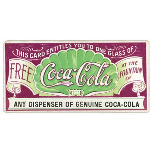
The first promotional marketing effort of Coca-Cola was a printed coupon in 1887. The coupons were promoting a free sample of the drink. Back then, this was considered a modern and advanced way of marketing.
The first-ever promotional product featuring the logo of Coca-Cola was a calendar, produced in 1891. The calendar was created by Asa Griggs Candler, the businessman who started acquiring the rights to Coca-Cola in 1888. The calendars were distributed to pharmacies and Soda Fountains that sold Coca-Cola, serving both as a promotional tool and a way to decorate the establishments.
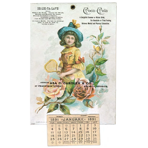
I find it interesting that both “C’s” in the logo printed in this calendar resemble the “golden ratio” that is considered a “divine proportion” by photographers and designers. This logo was used only between 1890 and 1891, but it illustrates how ahead of their time the people behind the branding efforts were, searching for perfection. Their early adoption of red color, which is the most emotionally charged color you can use for branding, also evidences their pioneering approach.
In the following years, the brand’s promotional items expanded to soda fountain urns, clocks, trays, posters and even bookmarks.
Fast forward to the mid-1980s, and an emerging and lesser-known fashion designer named Tommy Hilfiger created the first-ever Coca-Cola clothes collection. This line of leisurewear, highlighted by the iconic Coca-Cola long-sleeve rugby shirts, quickly captivated the attention of millions of Americans, propelling the innovative designer into the limelight for years to come. And yes, of course, everyone who was anyone was wearing Coca-Cola’s branded apparel as a fashion item!
Today, according to a short history list provided by the brand itself, it is documented that “Coca‑Cola” is the second-most widely understood term in the world, after “okay.” In 2023 net annual revenues of this company grew by 8% to $12.0 billion.
Now let’s have a look at companies’ promotional apparel range and strategies today.
Coca-Cola’s promotional products today
As you can see from a quick glance at Coca-Cola’s early branding history, they started with promotional products from the very beginning. Today Coca-Cola has one of the largest ranges of promotional products. Their promotional merchandise range covers a wide spectrum of products: apparel, accessories, festive decors, collectibles, beauty, pet products, travel products, handcrafted goods, accessories for bottles and cans, drinkware, items for the home, family and entertainment products. Yet promotional apparel is the largest, most impressive and globally known range that we will be looking at today.
The main source of this analysis is Coca-Cola’s store which has the biggest selection of brand promotional apparel that I could find.
It is a large very interesting list, which will be broken down for you by reviewing the most interesting and standout ideas.
Apparel
Coca-Cola’s apparel strategy, as you can imagine, is vast and interesting. They strategically cover unisex, women, men, and youth. Everything from traditional tees, polos, sweatshirts, hoodies, and jackets to less obvious yet interesting choices such as boxer shorts, lounge pants, onesies, and swim trunks. They still collaborate with designers and brands, for example, a few recent collaborations include Champion, Malbon, BAPE.
The style of apparel print/decoration is designed to appeal to every generation. Everyone, from Baby Boomers to Gen Alpha will find something matching their preferences. There are some subtle designs, only showing small logos, earthy colors, retro looks as well as loud, shouting designs that would easily keep you safe if you would be wearing them whilst doing road works! But in general, the color palette is slightly muted / pale, with red apparel being the minority compared to a total number of color options. This indicates the brand strategy is to have their apparel worn casually every day, instead of putting the brand colors of red and white on most of their clothing items.
Tees and tops
Coca-Cola’s tees and tops is by far the biggest apparel category, with 141 types of products, stylistically setting the tone for strategy in other apparel categories. Except for a few long sleeve tees, polos and tanks, this category is dominated by the traditional t-shirt. Prices range from very affordable $14.99, all the way up to vest costing $190.
I will spend more time reviewing tees and tops so you will understand Coca-Cola’s apparel strategy overall. Then in other apparel categories (sweatshirts and hoodies, loungewear, jackets), I will mainly highlight unique items and strategies that stand out from the general tone.
In their tees and tops unisex category at the time of this article Coca-Cola has 85 items. The men’s category has 18 models. The women’s category of tees and tops has 38 unique tees.
As you can see from the numbers, Coca-Cola manages their promo product budgets very safely and responsibly. Both the women and men categories combined have less than half of tees, and more than half of the range is made of unisex tees.
Stylistically, the tees and tops are either designed in rustic, or 60’s – 90’s retro styles, which for a brand with such a long heritage is easy to accommodate, allowing them to create a range which resembles that of a major retail clothing store.
Tees and tops colors
I remember when for the first time I took a closer look at the full t-shirt range of Coca-Cola, I was rather surprised to find out that it wasn’t only comprised of red colored products. Then I started remembering instances when I had seen people wearing Coca-Cola clothing, and indeed, most of them were of any color other than red!
Most of the colors are rustic, muted, and earthy. There are few bright, vibrant options that look great too but these are in the minority in the tees and tops range by Coca-Cola. Below is a table I’ve created in January 2024 to see which colors are dominant:
| Unisex | Women | Men | Total: | |
| Black | 15 | 11 | 2 | 28 |
| White | 7 | 1 | 2 | 10 |
| Cream White | 2 | 4 | 0 | 6 |
| Natural Cotton | 7 | 1 | 0 | 8 |
| Tan | 1 | 1 | 0 | 2 |
| Green | 5 | 3 | 1 | 9 |
| Navy Blue | 7 | 1 | 3 | 11 |
| Blue | 4 | 1 | 2 | 7 |
| Teal | 1 | 0 | 0 | 1 |
| Red | 17 | 9 | 3 | 29 |
| Burgundy | 1 | 0 | 0 | 1 |
| Cardinal | 1 | 0 | 0 | 1 |
| Pink | 0 | 1 | 0 | 1 |
| Purple | 1 | 0 | 0 | 1 |
| Yellow | 5 | 1 | 0 | 6 |
| Grey | 6 | 4 | 4 | 14 |
| Brown | 2 | 0 | 0 | 2 |
| Charcoal | 2 | 0 | 0 | 2 |
| Granite | 1 | 0 | 1 | 2 |
| Total: | 85 | 38 | 18 |
As you see, items with Coca-Cola’s red color represent only 29 out of 141 color choices, which is just a little above 20%. It is then followed by black, various shades of white, grey and blue.
In my opinion, it is important to take note of Coca-Cola’s colors strategy on their tees and be open-minded when planning your own branded t-shirt. Don’t shy away from pale, muted and rustic colors: people might wear your branded t-shirt more often when going outside!

Tees & tops methods of decoration and locations
Here Coca-Cola’s strategy is very straightforward: impactful screenprint on the front. Depending on the tee’s material color, designers went with red, white, or sometimes a dark logo. There’s a lot of supporting artwork incorporated within the print area, such as ramen, taco, burger, Santa, bear, etc, so there is something for each audience.
The print artwork ranges from freshly looking with clear edges to a washed-out vintage logo effect. The majority of prints are vintage-looking, complementing the overall strategy and style.
Sweatshirts and hoodies
The Coca-Cola Brand strategy with sweatshirts and hoodies is relatively similar to their tees strategies: subtle, casual-looking apparel with strong and impactful branding on the front chest, and a few items with logo’s on the left chest, and/or back. A few items have logos or slogans in various languages covering the entire surface. The color pallet is mainly pale too with an even smaller percentage of red items.
There are 44 unisex items, and only one hoodie dedicated to men, and 26 female items, amounting to 71 items in total. The company plays a very safe gender approach here.
In this category, there are a few products that belong to the Color Block range, which clearly stand out. Some elements of hoodies or sweatshirts are made from different, contrasting colors, naturally attracting our conscious or subconscious attention. The Coca-Cola logo is embroidered on the red patch which is attached on the left chest of the hoodie or sweatshirt. The back has a large impactful logo across the shoulder blades with supporting text, together stating: Drink Coca-Cola “Ice Cold”. There is also a line saying “Ice Cold” in Japanese.
Another interesting design choice is the covering of hoodies (and one sweatshirt) in Coca-Cola logos or slogans in multiple languages. This is a not-so-subtle reminder of the brand’s popularity across the globe. Yet, I really like this idea and I think that the more global or international brands should be decorating their apparel this way. As you can see from the image below, it looks rather good.
Coca-Cola’s loungewear, shorts and pants
Loungewear is where Coca-Cola’s strategy looks as you would expect it to look if you didn’t analyze tees, tops, hoodies and sweatshirts. With loungewear, they tend to go with bright red, loud, large logos covering large or all portions of the clothing item. Unisex has 13 items, men’s loungewear has 14, and women’s has 31. That’s a huge selection for women, who are clearly targeted as better customers for these products. Not surprisingly, they get to choose from some very interesting items.
Boxer shorts (men)
The range of bright and loud boxer shorts covered with logos, images of a white bear or products look rather fun. Not too many companies can proudly state they offer a successful selection of promotional boxer shorts in their range, so thumbs up to Coca-Cola’s marketing department for being brave and creative!
In my opinion, they are targeting female shoppers searching for gifts, rather than men directly, but if it works, it works.
Shorts and pants
I am putting both shorts and pants into one category because I see the same strategy applied to both of them: men’s shorts and pants have very few items in the range, yet those they offer have bright colors or branding, covered with multiple logos patterns from edge to edge. These are loud and noticeable. Will the general public be wearing these when going to the shops or visiting friends for a BBQ in the garden? Probably, on most occasions, not.
The women’s selection is more interesting. The female short and pants styles are split into two: the first half is fully covered by logo patterns, just the same as men’s shorts and pants. But the second half looks much more like a clothing brand: single, mainly pastel color material with one (usually white) logo.
Grey fleece shorts with a subtle square pattern and a dark red logo look cozy and almost high fashion. French terry white cream shorts with a polar bear wearing sunglasses and leaning on the logo look good too. The polar bear pattern on grey fleece shorts look really cozy, subtle and stylish.
Rose and mint-green Hacci shorts with a small word “Coke” look like something Nike could produce. I could easily see people jogging in them. Someone at Coca-Cola thought exactly the same so they also launched similar lounge pants.
All in all, the loungewear is clearly female orientated and, just as with tees, tops and hoodies, Coca-Cola has done a brilliant job here.
Onesie
In the Coca-Cola store, their white unisex onesie is marketed as a bestseller in the lounge category and it doesn’t surprise me at all. White fleece with red cuffs and logo on the chest are topped up with an icon polar bear ears on the hoodie. This is a true example of branding continuity, mixed with innovative thinking and following of trends. I can easily see myself wearing one on cold winter evenings. I can also see myself gifting one to my partner for next Christmas (taking a note on the calendar).
P.S. Since 2015 the onesie is more or less on a steady upward trend of popularity, and if you’ve exhausted unique promotional apparel ideas for your brand, this is definitely one to consider.
Coca-Cola’s promotional headwear
As with tees and tops, hoodies and sweatshirts, Coca-Cola, in my opinion, hits the bullseye with their headwear selection. All items have the big Coca-Cola branding on them, yet almost none of them look cringe or tacky, with the exception of the bucket hats. These look neither casual nor collectable but are still interesting.
Headwear has 64 items in them, including 11 beanies, 40 baseball caps, 1 polar bear earmuffs, 1 trapper hat, 1straw beach hat, 1visor, 8 bucket hats and 1 beanie hat.
Headwear colors
All beanie hats and baseball caps are following a casual clothing trend. Close to 20% of baseball caps are red, the rest are a mix of blacks, white, blue, grey and green. Most baseball hat colors are already slightly pale as if they were exposed to the sun and have faded. These cap colors will age brilliantly.
The beanies have more vivid colors to cheer you and the people around you up during dark and cold winter days. Well done to the Coca-Cola team!
Headwear decoration locations and methods
This category is mainly decorated with embroidery and patches. The company clearly wants these items to last, and, from my personal experience, they definitely will. Only the beanies are printed in patterns and there is one trucker cap. The vast majority of caps and beanies have large logos on the front which still look great thanks to the high quality decoration, 3D embroidery, or really nice patches. You can see that the brand is not saving the budget here, the designers were let loose to create something for everyone and in my opinion, they have succeeded.
Socks
Less visible, but even more effective when noticed, this item of Coca-Cola’s promotional apparel lineup is socks. To be noticed, promotional socks have to be loud and bright, and Coca-Cola does just that. There are 28 items available right now, some of them are packs of 2,3,5 and 6. All of them are either bright by themselves or in the case of a few black and gray products, they have bright colorful artwork in them.
Coca-Cola’s target audience are women, 19 items are for females, 7 for males and one item is marked as unisex.
All seasons and styles are covered, including warm cozy polar bear socks, slim shoe liners, and slipper socks. Well done – in my opinion, every single brand that believes in itself and can afford should have a range of quality socks. Free promotional socks for everyone!
Conclusion
Congratulations for making it to the end of this article. This probably makes you a promotional products nerd, but in my opinion, this is a good thing! What did we learn? Coca-Cola’s promotional apparel range is absolutely huge! Items that are being worn on the outside (tees, tops, hoodies, caps, etc) are manufactured in subtle colors. Branding blends in a way that makes them look as any retail clothing brand. Retro and rustic styles dominate in these categories. The majority of the items are unisex.
When it comes to more intimate items, such as loungewear and socks, Coca-Cola goes all in with bright colors and targets a female audience.
I do agree with everything that this brand is doing. I only missed one thing: QR codes to be incorporated somewhere. I haven’t seen one. Today QR codes can be incorporated in the piece of art. It’s a seriously great way of engaging with people. At the time of this article, there is not a single reference of Coca-Cola’s apparel with QR codes, instead there are only a few projects with drink cans that show QR codes on them. I think we will be seeing Coca-Cola incorporating QR codes in their apparel in the near future.